
At the start of the project, one of our first challenges was establishing an art style and turning it into a clear, repeatable method. Beyond optimization, we needed a workflow the entire team could easily follow, with a final look that felt clean and distinctly comic-book-inspired for a VR game.
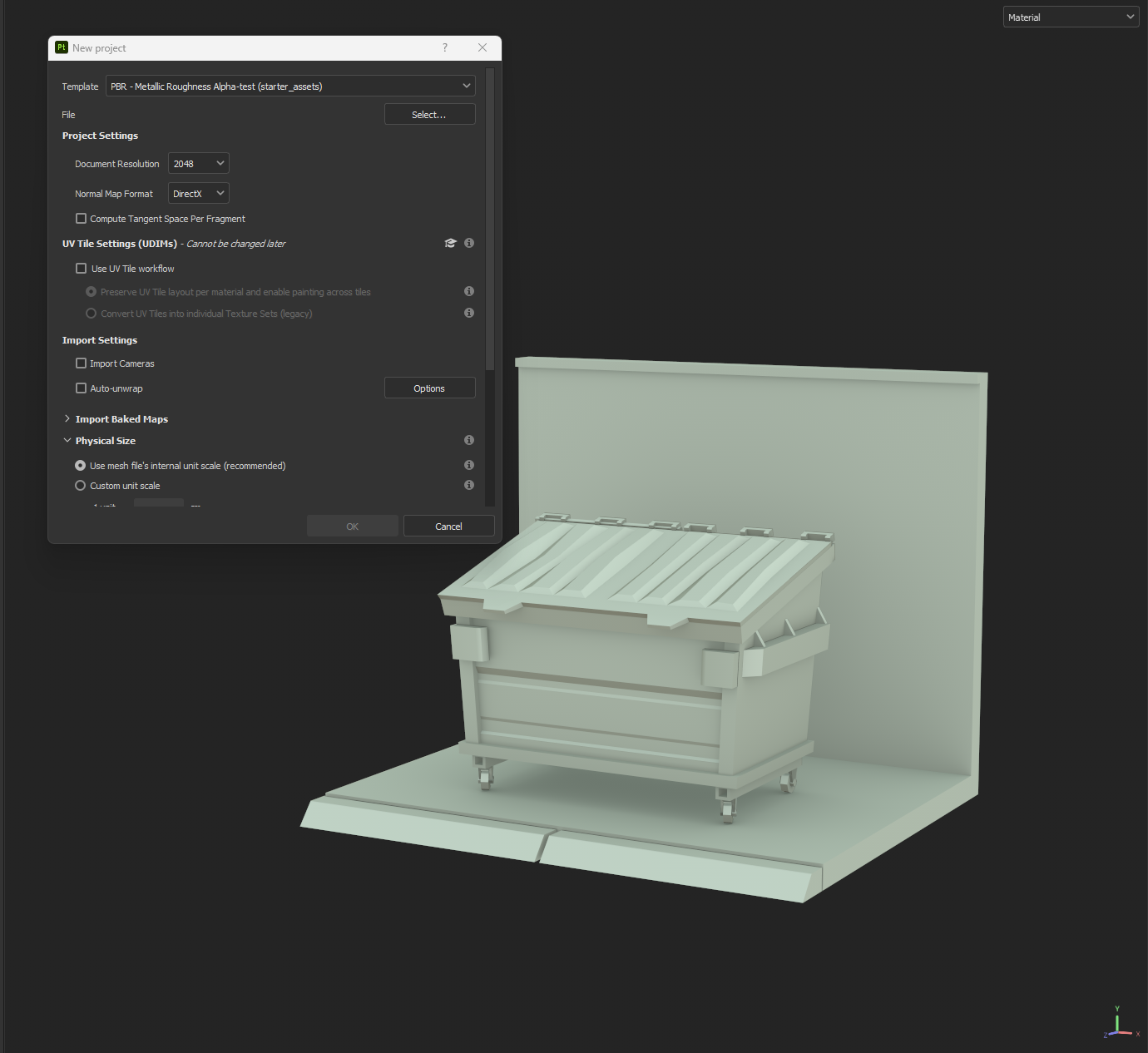
The plan was to lean into bold black ink and visible line work directly on the textures to reinforce that comic style. Using an outline shader would have been ideal stylistically, but it was too expensive performance-wise. Instead, we aimed for a fully baked solution using only the Albedo map (at least for the props in the early stages). To make the process consistent and team-friendly, I created a Smart Material and a structured layer system in our texturing tool Substance Painter. This allowed everyone to plug into the same workflow and achieve a unified comic look without endless tweaking.
There are, of course, other methods that could produce higher quality results. But given our time constraints, this was the most efficient way to hit our targets, both visually and technically. I won’t go into the full breakdown here, but this offers a quick overview of how most prop art was handled during production.
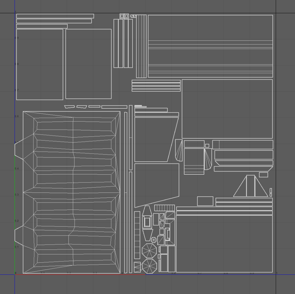
Step 1 : Our first priority was to make the most efficient use of the UV space, aiming for the highest possible texel density (consistency is important here between relative assets). We also prioritized faces that are more visible to the gameplay camera, giving them bigger UV islands compared to hidden or background areas. I aimed to keep a consistent texel density while staying flexible based on the asset’s role. The general rule of thumb is 1 unit = 1 meter
1024×1024 texture for a standard-sized asset / 512×512 for smaller props (under 1m in height/width/depth) / 2048×2048 for “hero” assets that are more prominent or close to the camera.
Textures are always kept square to avoid issues when merging or reusing maps later on. Also while texel balance matters, it’s not rigid — asset importance, scene placement, and lighting all influence the final resolution choice.
Mirroring was a key part of the strategy too, if two faces are never visible at the same time, we mirrored them to save UV space. Since our style relies heavily on solid black areas, we could get away with using tiny, even single-pixel UV islands in spots that would just be filled with black anyway. This helped free up valuable space for the more detailed parts of the model.

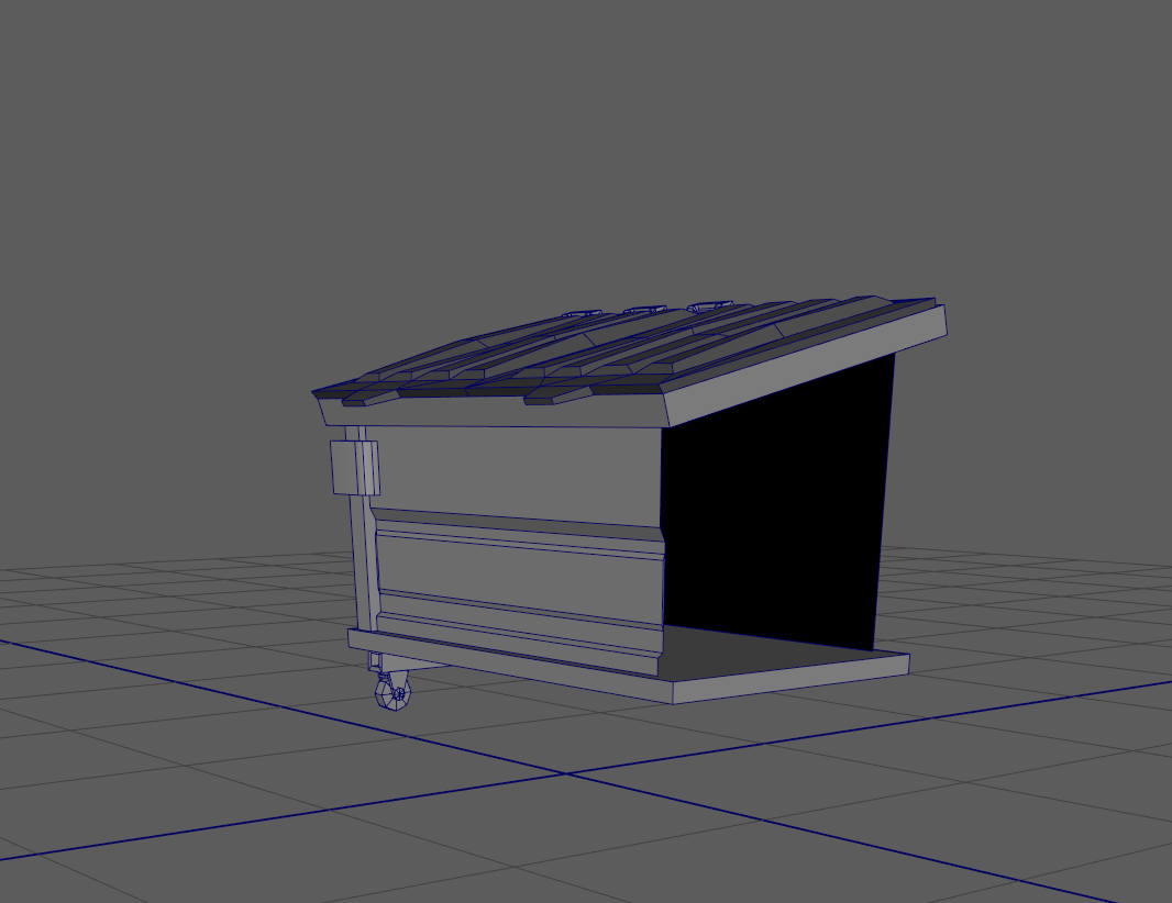
Step 2: We aimed to keep UV shells as square and straight as possible — even if it meant sacrificing a bit of UV quality. The reason for this is simple: line anti-aliasing becomes critical in the final stage. Since the style relies on sharp, clean black lines and flat color fills, straightened UVs help prevent blurry or jagged edges, especially around inked areas. It’s a small tradeoff, but it makes a significant difference in achieving that crisp, comic-style finish.
Step 3: We baked the low poly onto itself — no high-poly was needed for this style. The key maps we generated were:
- Ambient Occlusion
- World Space Normals
- Curvature
- Position Map
Note: A thickness map can occasionally be useful, especially for organic or subsurface-scattering assets, but it wasn’t mandatory for most hard-surface props.

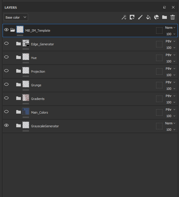
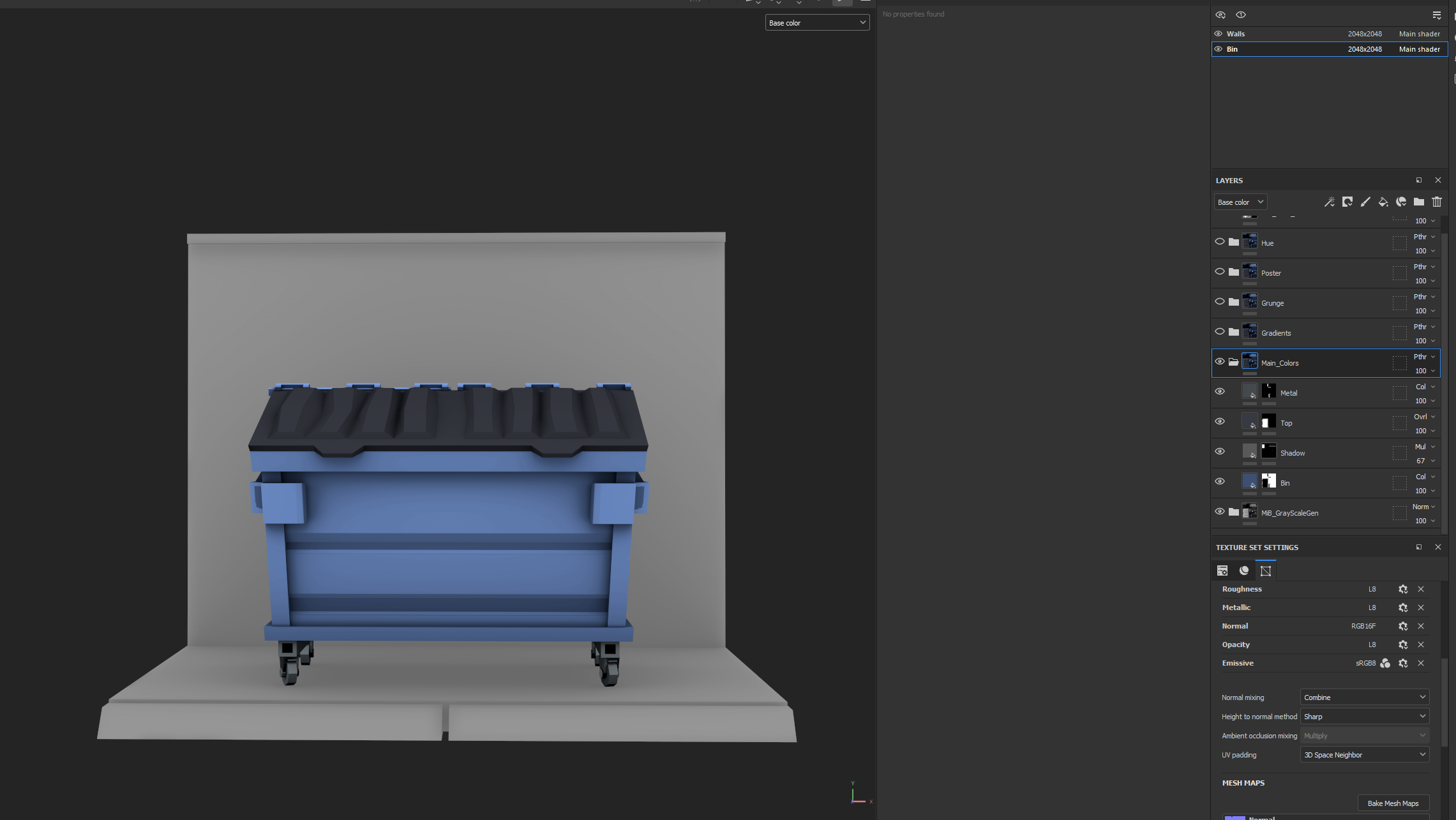
Step 4: The first folder in our Smart Material is called GrayscaleGenerator. Getting a solid grayscale base is essential for achieving the stylised look. At this stage, we focused on defining clear grayscale values based on material type—for example:
- Plastic / Wood → mid-gray
- Metal → darker with stronger tonal contrast
- Fabric → lighter and more matte
Since we were baking lighting directly into the albedo map, the purpose of the grayscale values went beyond simply defining materials. The main goal was to make the asset feel visually lit—even without any dynamic lighting. It wasn’t just about accuracy; it was about faking light and depth within the texture itself. I always prefer an artistic look over strict realism, prioritizing shapes, contrast, and readability over physically accurate materials.

Step 5 Applying base colors: Once the grayscale was set, the next step was to apply base colors.
For consistency, it’s best to use precise color codes, especially when matching a concept. In most cases, the concept artist will provide specific hex values or reference swatches-sticking to those ensures visual consistency across the assets library.
Within the Color folder, add fill layers with only the Color channel enabled. As a best practice, press C to swtich to base Color view, which keeps the focus on color information. When adding new layers in this folder, you can use blending modes such as Overlay or Multiply to adjust values relative to the grayscale. The color information will inherit its strength from the grayscale base beneath it.
This stage is primarily about blocking in the main colors and values, which will serve as the foundation for further detailing.
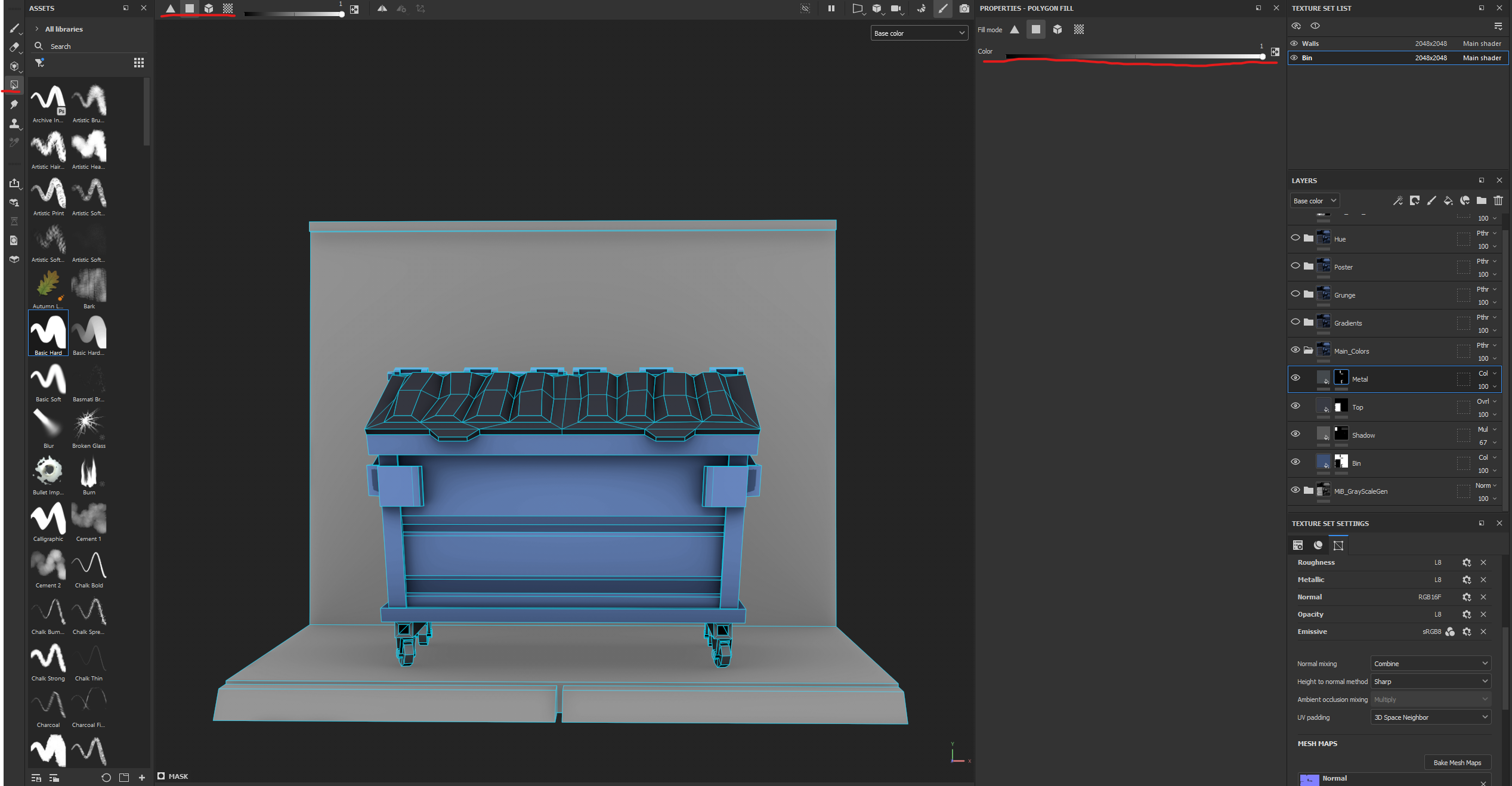
You should also use the Polygon Fill tool to speed up the process, especially when applying base colors to specific areas.
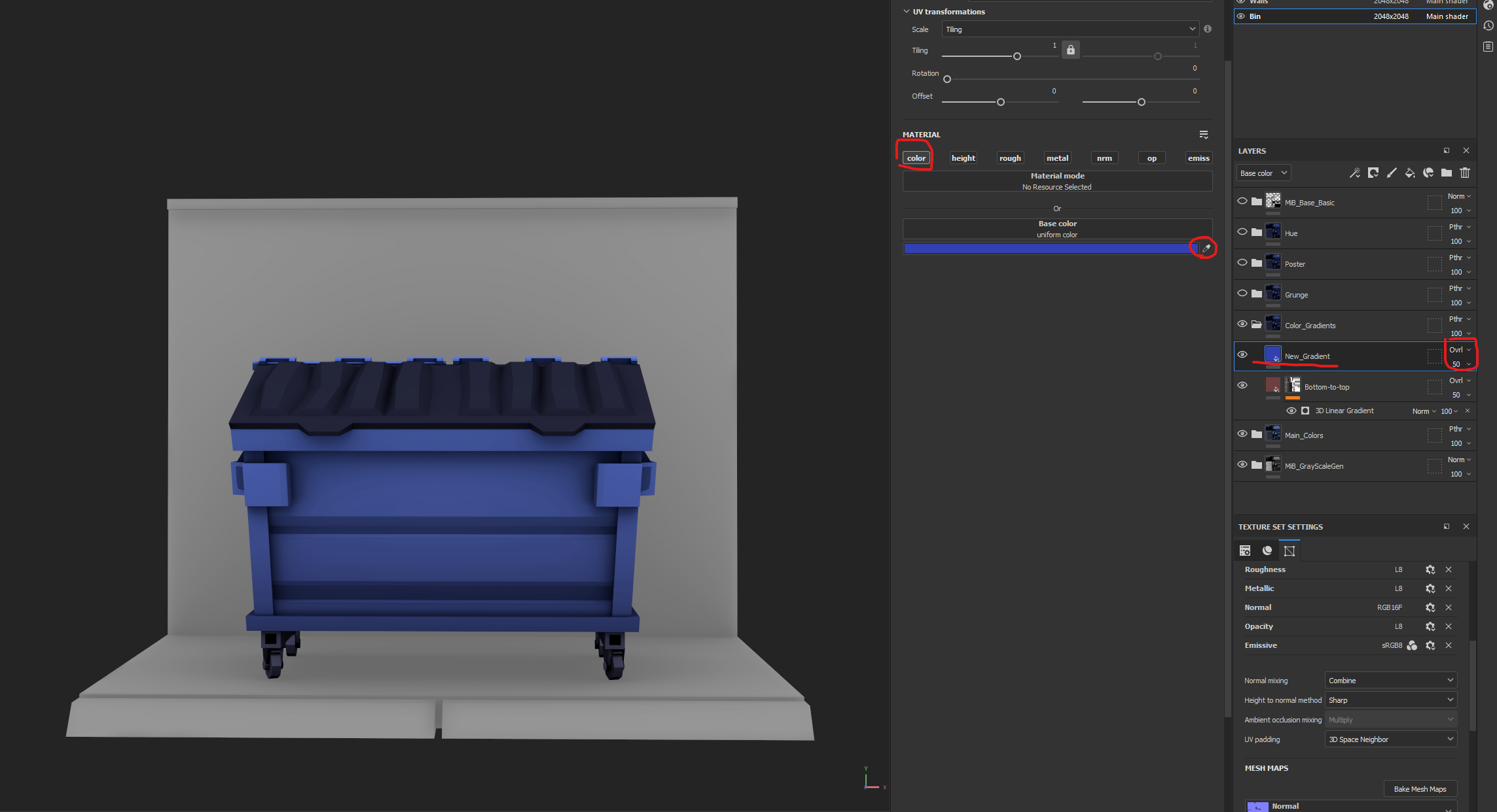
Step 6 Color Gradients: In this folder, it was time to add linear gradients for stylization and to reinforce the comic-like look. Gradients should be used generously, but I mainly applied them to the larger areas of the model—shifting from warm tones to cool tones. For smaller parts, I typically adjusted tonal values rather than changing the hue.
Create subtle gradients across every coordinate (X to –X, –Y to Y, etc.). The difference might seem minimal—and it should be—but once the asset is placed in-engine, the eye picks up on these shifts very quickly, adding depth and visual interest.
I usually kept gradient layers set to Overlay at around 50% opacity, but you may want to experiment to achieve different effects on different parts of the asset. Nothing is set in stone here; adjust the settings based on the look you’re aiming for.
Step 7 Grunge: Grunge was a straightforward but important step in giving the assets depth and a sense of storytelling. For this project, I defined three main grunge types (though the library can always be expanded):
- Dirt — used for heavily worn or frequently touched areas, usually following ambient occlusion or high-contact zones.
- Paper — simulates torn posters, stickers, or similar surface details.
- Greenery — simulates moss or similar organic buildup.
When I say “simulate,” I’m exaggerating a little. The layers and brush strokes were intentionally simple and far from realistic. The goal wasn’t accuracy, but rather to add depth and stylization that enhanced the overall look.
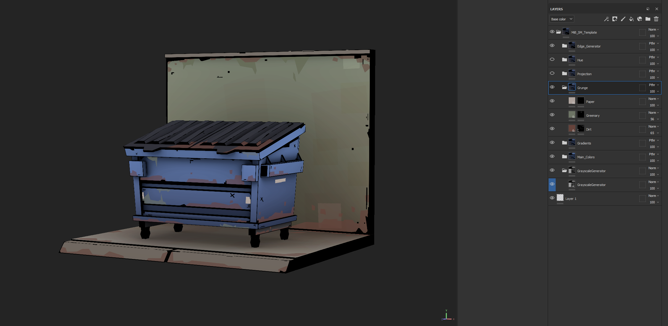
Each grunge type should have a distinct visual language. For example, dirt might follow soft triangular patterns, greenery could be expressed through line-based strokes, and rust may work best with cross-hatching. It’s important for all artists to align on a shared grunge language to maintain consistency across the entire asset library. Preparing reusable PNG masks can also speed up the process.
It’s also worth mentioning that, while painting, it’s important to maintain stroke consistency across all artists to preserve the overall style. Once the scene starts filling up, inconsistent strokes can quickly make things look messy. To keep the “marker pen” stroke effect as much as possible (and avoid AA issues), I defined an acceptable brush stroke standard. Here, I’m referring specifically to the style of the stroke itself, not the subject matter being painted with it.
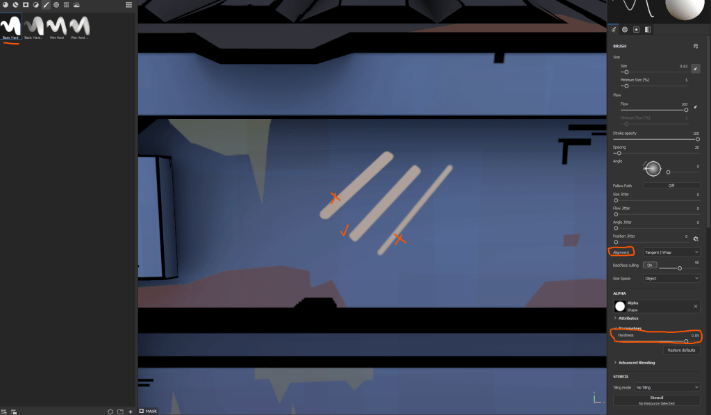
Start with a default brush and remove its alpha shape (since almost every brush in Substance Painter comes with an alpha by default). This gives you a sharp, full-pixel painting brush, which is especially useful for creating clean straight lines. For softer passes such as when drawing curves use default brush, increase its hardness as much as possible, and paint by snapping point-to-point while holding the “Shift”. Again simplicity is key for this type of stylization.
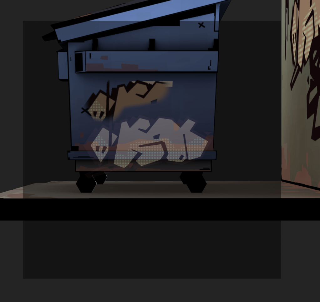
Step 8 Projection: Projection is straightforward: you project 2D artwork onto your 3D asset. These 2D elements are usually prepared in Photoshop using an approach similar to the workflow described here. I try not to overwhelm the asset with graffiti or decals—less is often more. For stronger visual impact, it helps to use opposite colors. For example, if an asset is primarily blue, I start with accents in yellow or orange to create contrast and draw attention.
Blend subtly, adjusting opacity or layer modes as needed so the projections integrate naturally instead of looking pasted on. Done right, projection adds unique character and stylization without overpowering the underlying material work.
Step 9 Hue Shifts: For this step, I used block strokes — rectangular shapes with around 10–50% opacity — to introduce subtle local hue shifts across the asset. This wasn’t full hand-painting, as the scope of the project didn’t allow for that. Each asset needed to be completed within a few hours, so speed was critical. Instead, these hue-shift strokes added just enough variation and imperfection to evoke a hand-painted feel, while still keeping the workflow efficient and streamlined.

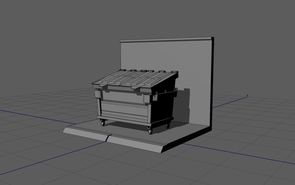
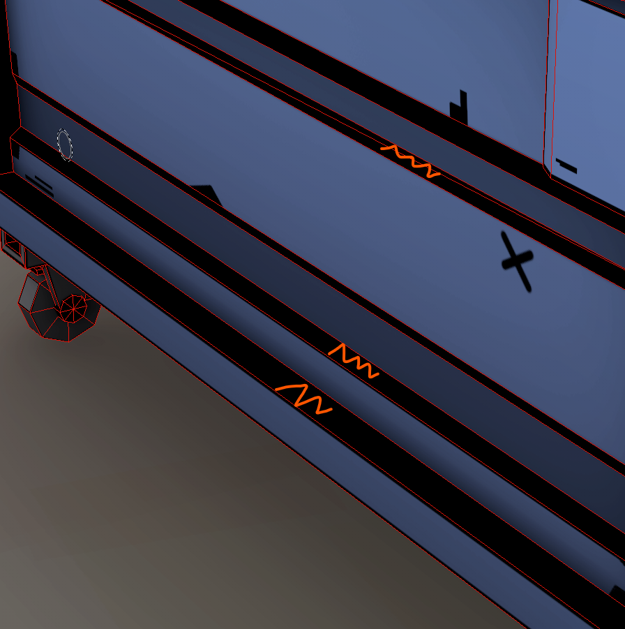
Step 10 Black Lines: This stage is one of the most important: now we add the black line work to the asset. After baking our maps and applying the Smart Material, we automatically get some line work around the edges. However, this is only a starting point. In most cases, the lines need cleaning, refinement, and adjustments to their thickness.
Line thickness is critical for consistency. Larger assets at higher resolutions require proportionally more pixels for their line work so that all objects in the scene feel cohesive—like they were drawn with the same pen.
Can line work be formalized into a strict set of rules? Technically, yes. I’ve experimented with that. But in day-to-day production, artists often set aside rigid rules and instead rely on references and feedback. That’s fine, and I don’t insist otherwise. What matters most is following a few guiding principles, especially around line thickness, to maintain consistency across the project.
Apply line work along the edges of your model, but don’t leave it as a uniform outline. Break it up, erase, or soften areas to suggest an intentional hand-drawn stroke rather than something generated by a shader. The more you loosen the line work (without exaggerating, of course), the more unique and hand-crafted the model will feel. Black lines can also double as dirt accents in worn or high-contact areas.
If edges are very close to one another, it’s often best to paint the entire area pure black. Planning for this during UV layout can save a lot of space and time. Some UV islands may even be deliberately kept small because we know they’ll be painted solid black—these areas are either in deep shadow or too minor to justify detailed work given our game’s style.
Ultimately, line work is one of the best tools for making even the most uninteresting parts of a model visually engaging. To keep the process manageable, I recommend adding a quick paint layer on top of the fill layer. This makes later tweaks far easier.

This is a simplified overview of my core workflow for environment and prop development on Men in Black: Most Wanted VR. The approach shifted frequently to meet the needs of production, but I hope this breakdown offers some insight into the process and the balance between style, speed, and consistency.
